

It's easy to feel that your data is unreliable. It's much harder to say, with evidence, how unreliable it is, which parts are worst, and what to fix first. A data quality maturity assessment turns that gut feeling into a defensible baseline - a score you can put in front of a board, hand to a team, and measure progress against.
This guide walks through how to run one. A data quality maturity assessment is a structured review that scores your organisation's data across defined quality dimensions and against a maturity model, producing a baseline and a prioritised list of where to improve. Below you'll find what to scope, a scorecard you can adapt, the steps to run it credibly, and how to turn the results into action. If you haven't yet agreed what "good" means, read what good data quality looks like first - this assessment measures you against exactly that standard.
What a maturity assessment is and isn't
A maturity assessment is not a one-off data audit that counts errors in a single table. It's a broader, repeatable diagnostic that answers three questions at once: how good is the data itself, how mature are the practices that keep it good, and where should effort go first.
That dual focus matters. You can have clean data today through heroic manual effort and still be immature, because the moment those people move on, quality collapses. Conversely, a domain with some errors but strong ownership and monitoring is in far better shape than its error count suggests. A good assessment captures both the state of the data and the strength of the operating model behind it.
Before you start: scope it tightly
The fastest way to make an assessment useless is to try to cover everything. Three scoping decisions keep it focused and credible.
- Choose the domains that matter. Assess your highest-value data first - typically customer, product, supplier, and transactional data. These drive revenue, cost, and the decisions leaders actually care about.
- Choose the dimensions you'll score. The six core dimensions are accuracy, completeness, consistency, timeliness, validity, and uniqueness. Not every dimension matters equally for every domain, so you'll weight them later.
- Choose who contributes. Combine the people who produce the data, the people who consume it, and the people who own the systems. The gap between how trustworthy producers think the data is and how trustworthy consumers find it is itself a powerful finding.
The data quality scorecard
Score each dimension, for each domain, against a five-point maturity scale. The scale below mirrors the standard maturity model, so your scores map directly onto a recognised progression.
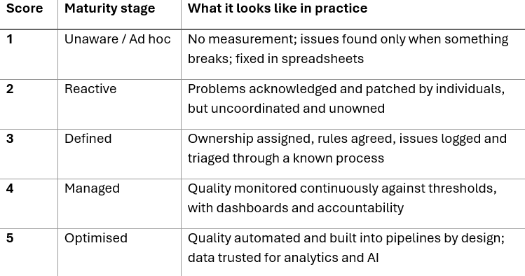
For each domain, you end up with six scores - one per dimension - which you can average into a domain score, and then roll up into an overall organisational maturity score out of five. Keep the individual dimension scores visible, though: the average hides the very gaps you most need to act on.
To see how this works, take a customer domain. You might score it 4 on validity (formats are well controlled at entry) but 2 on uniqueness (duplicate records are common) and 2 on consistency (the CRM and ERP disagree on account status). The average - around 2.7 - looks middling, but it conceals the real story: customer records are duplicated and contradictory across systems, which quietly distorts every segmentation, sales report, and cross-sell analysis built on them. The dimension-level detail points you straight at master-data and integration work, while the average alone would have told you almost nothing actionable. Repeat this for each domain and the weakest, highest-impact combinations rise to the top on their own.
Running the assessment, step by step
1. Gather evidence, don't just ask opinions. For each dimension, collect something concrete - a duplicate-record count for uniqueness, a missing-value rate for completeness, a cross-system reconciliation for consistency. Pair these hard measures with structured interviews so you capture both the numbers and the lived experience of the people using the data.
2. Score independently, then calibrate. Have producers, consumers, and owners score separately before comparing. Where scores diverge sharply, that disagreement is a finding worth recording, not a problem to average away. Hold a short calibration session to agree a final score and capture the reasoning.
3. Weight by business impact. A defect in data that drives pricing or fulfilment matters more than the same defect in a rarely used field. Apply a simple weighting - high, medium, low - to each domain and dimension so your priorities reflect value, not just volume of errors.
4. Aggregate and visualise. Roll the weighted scores into a clear picture: an overall maturity level, a score per domain, and a heat map showing which dimension-and-domain combinations are weakest. A one-page visual is what gets the assessment understood and funded.
5. Document the cost. Wherever you can, attach a business consequence to the worst scores - the rework, the lost cross-sell, the decisions made on wrong numbers. This is what turns a technical diagnostic into a board-level case for action.
Turning scores into a roadmap
The assessment is only valuable if it changes what you do next. Read the results through two lenses. First, the lowest weighted scores tell you where to act - the high-impact, low-maturity combinations are your starting line. Second, the pattern across dimensions tells you what kind of action is needed: widespread low scores on consistency point to integration and master-data problems, while low timeliness points to pipeline and process issues.
From there, the path is well established. Assign ownership for the priority domains, agree target thresholds, remediate the worst defects at their root cause, then stand up monitoring so quality is maintained rather than re-broken. Many organisations discover at this point that their data quality function is simply too small for the task - which is a question of how to structure and grow the team, not just adding people. And to make improvements durable, the controls need to live in the platform itself, which is where implementing Microsoft Purview and modern governance tooling come in.
Common mistakes to avoid
- Scoring on opinion alone. Without evidence, scores drift toward optimism. Anchor every score in at least one concrete measure.
- Treating it as one-and-done. Maturity moves. Re-run the assessment on a regular cadence so you can prove progress and catch regression.
- Averaging away the detail. A respectable overall score can hide a critical domain sitting at stage one. Always act on the dimension-level scores.
- Stopping at the score. A baseline with no owner and no roadmap changes nothing. Build the next step into the exercise from the start.
Get your baseline
You can't improve what you haven't measured, and you can't fund what you can't quantify. A maturity assessment gives you both - a credible score and a clear first move. The organisations that progress fastest aren't the ones with the best data today; they're the ones who measured honestly and acted on the worst gaps first.
Use our data quality maturity assessment to score your organisation across all six dimensions and receive a recommended next step - or talk to our team about turning your baseline into a delivery roadmap.
.png)
.png)
.png)


